Sale Cart
Creating an app that allows users to order their groceries based on discounted recipes straight to their home.
- UX Design
- UX Research
Design Process
The design process for this project was very research heavy as I needed to make sure I was solving a problem that users actually had.
-
1
Understand
Conduct 1 on 1 interviews and competitive research to understand users' pains and if there are any apps that solve these problems.
-
2
Define
Create a problem statement that I wanted to address and who I was solving the problem for.
-
3
Ideate
Create users flows and sketches before going using Adobe XD to create my low fi designs.
-
4
Validate
Conduct usability tests before creating the hi-fi mockups
1. Understand
I needed to understand people’s grocery shopping habits and validate that there is a real need for an app that helps users find recipes.
User Interviews
I interviewed 5 people with an age range of 21-53 in person.
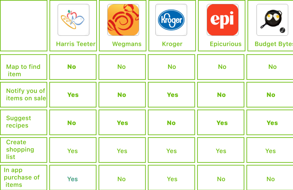
Competitive Analysis
I looked at grocery store apps and recipes apps to identify the major functions of these products.
2. Define
This was a major point of realization! After conducting the interviews and competitive analysis, I discovered that users had goals that were not being fulfilled by current grocery and recipe apps on the market.
The Problem
Shoppers struggle to find new recipes that meet their needs on taste, nutrition, and most of all cost.
The Solution
Create a product that suggests new recipes based on ingredients that are on sale to allow the user to try new recipes to their liking and save money.
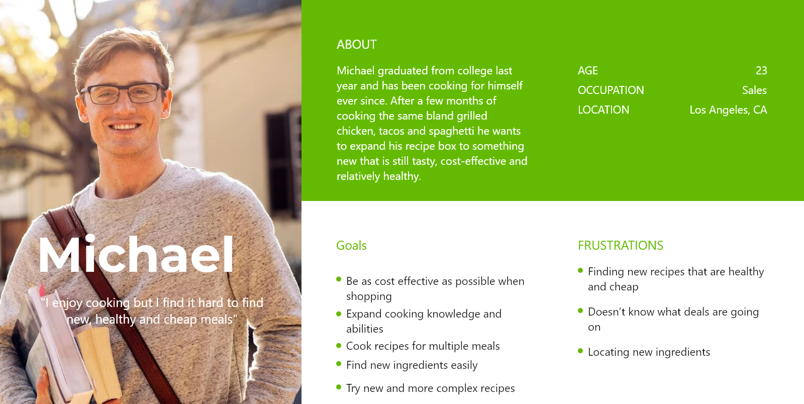
Persona
Once I was able to redefine the problem I was able to create a user type that I was going to build the app for. I decided to focus on younger users as they were more likely to use an app to find new recipes.
3. Ideate
Before designing straight on the computer, I like to sketch on paper and get a basic feel for how I want to design the layout and flow.
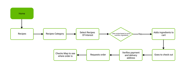
User Flow
I decided to focus on the path the user goes through to find a new recipe and locate its ingredients. Before creating the wireframe, I drafted the ideal paths users would take to accomplish key tasks.
Sketching
I prefer sketching on paper for my initial wireframe just to give me an idea before designing it on Adobe XD. It gives me a chance to go through as many layout ideas as possible without spending much time on them. I went through a lot of sheets of paper!
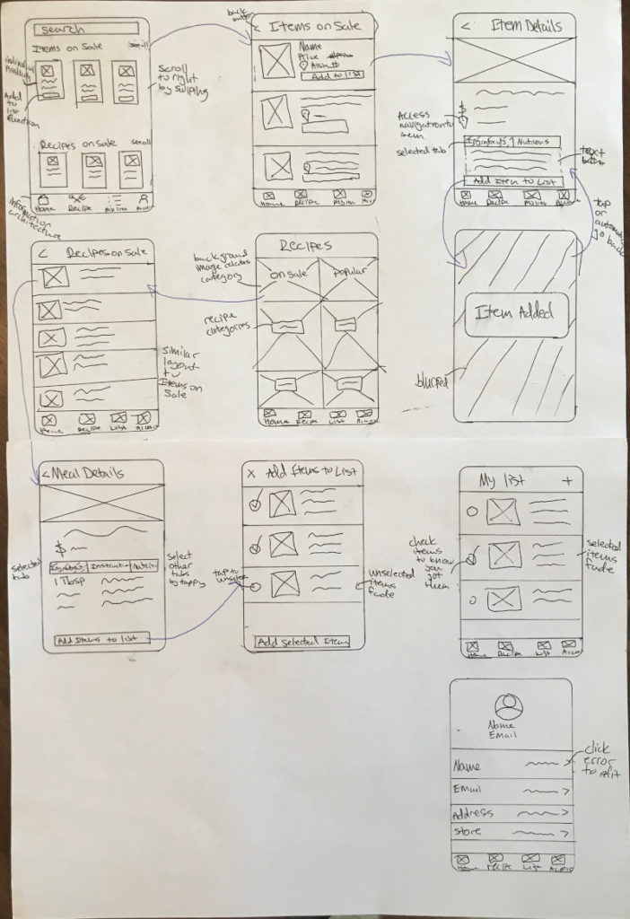
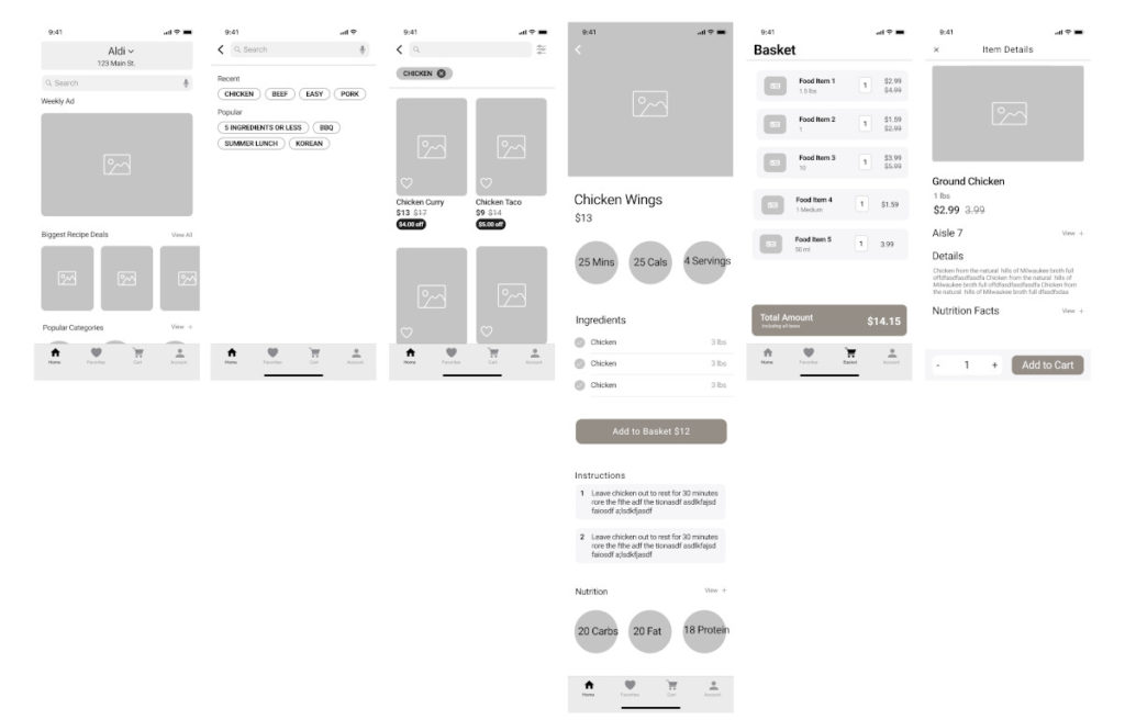
Wireframes
I created a low fidelity wireframe in Adobe XD and a clickable prototype to use for usability testing. These are some of the main screens.
4. Validate
I wanted to first validate this was a concept that users had an interest in. Next, I wanted to assess how well users interacted with the app, the main functions of the app and understand the user flows.
Usability Testing
I created a set of tasks that evaluated these goals and made users think out loud as they are completing the tasks.
I used guerilla testing and recruited 5 participants aged from 19 to 27.
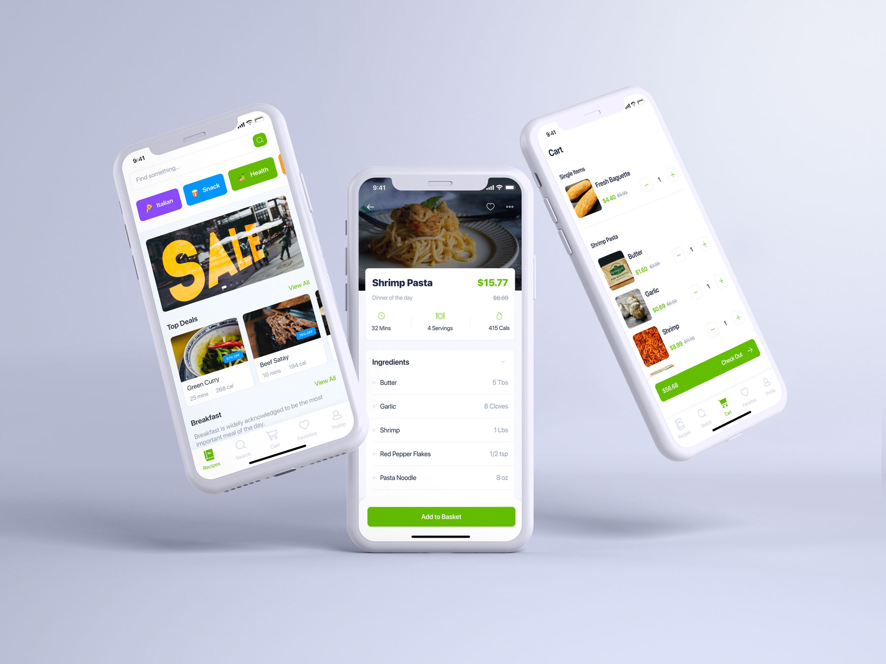
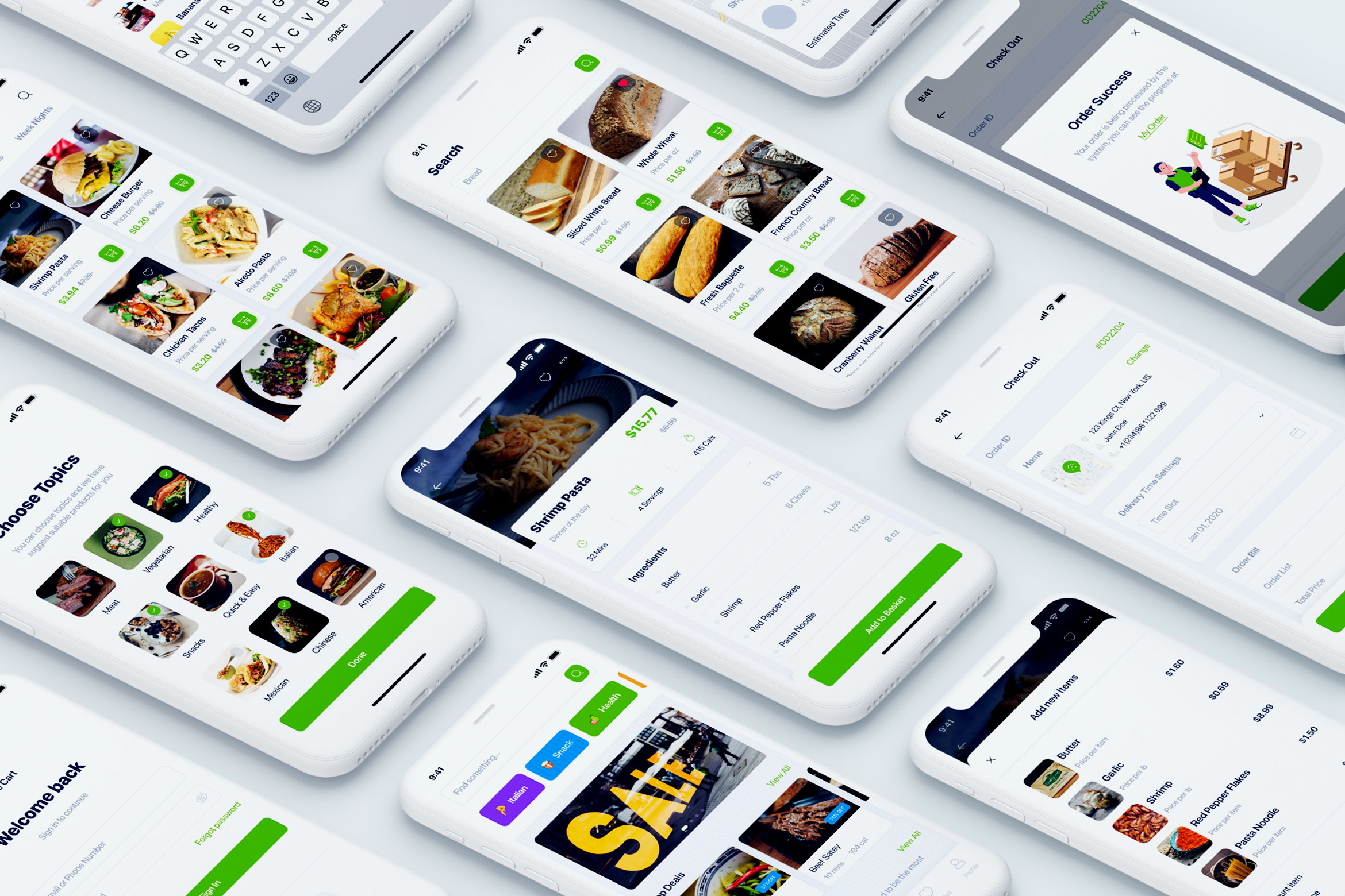
High Fidelity Mockups
What I Learned
After being able to go through all the steps of the process I came to realize how important it is to get feedback from users throughout the journey.
I think my biggest takeaway is to never assume how your user thinks, feels, or acts and make sure you are creating a product that is desirable by the user and feasible to create.